When it comes to interior colour choices, trends should not really come into it; we want to be happy with our finished look for a good few years, after all. However, when you’ve considered every shade of sage green or ‘greige’ twice, sometimes a look at the latest thing can give a shot in the arm, reassuring us that there are, in fact, more hues available than the million shades of grey we’ve been poring over.
For anyone considering a decorative do-over, these are the colours that are commanding coverage in glossy style bibles right now. Which is not to say you should slavishly choose them, but may just give some food for thought.
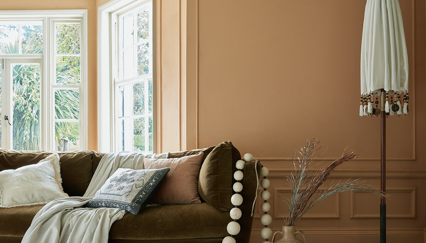
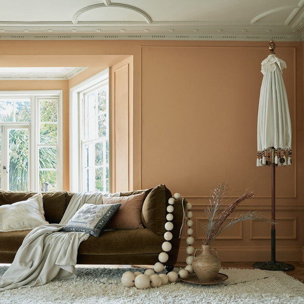
Deep Terracotta Orange

Forget the cool, undemonstrative colours that have dominated the world of interiors over the past few years. Warmth, heat and passion are back. Deep orangey reds are big news – and who wouldn’t want a slice of the Med all year round? They can be warm in winter and hot in summer – in short, ideal. We like this one from eco paint brand, Earthborn.
Soft Pinks

Pink is the new grey – and, specifically, pink that apes the colour of unadorned plaster work (who hasn’t wondered at some point whether they should just leave plaster walls as they are?) Farrow & Ball has the excellent and unambiguously named ‘Setting Plaster’ amid its pantheon of perfect hues. The beauty of it is that it’s soft and it’s soothing – and it goes with absolutely everything. Its dreamy when the woodwork is all done in the same colour, but equally it works alongside darker shades of pink, dark greys and spicy cinnamon colours too. It looks good everywhere too, from bedrooms to kitchens.
Vibrant Greens

In recent years, the shades of greens de jour were of the more muted, grey-end-of-green spectrum. Now, however, we’re seeing the resurgence of the full colour wheel of verdant hues. We especially love the brighter, freshly-cut-grass shades – as with the wonderful Edward Bulmer’s ‘Evie’. It works well with creams, strong greys, greens either side of the light or dark spectrum and even the popular pale pinks that are everywhere right now.
Browns

Brown doesn’t always get the best press when it comes to interior colour schemes. But we would encourage you to keep an open mind; not all browns are created equal. This one – a light buff brown with a touch of grey – from Lick Paint is, in fact, known as ‘Beige 02 Soho Farmhouse’. We love the soft rusticity of it, as well as the evocation of undemonstrative but effortlessly stylish country houses; it would be a dream, for example, in a roomy entrance hall with a settle and flagstones. Warm, welcoming but also not at all obvious. This beige-meets-brown proves that neither shade deserves the reputation for dullness that they so often get.
Orangey Yellows
Yellow can be an effortlessly cheerful colour. It can also be oddly insipid when it doesn’t quite hit the mark. It helps, then, to look for shades of this sunshine hue that have a real earthy depth and thus exude warmth. This Earthborn example, known as ‘Freckle’, has wonderful peach undertones and is blended from ochre and terracotta clays. Sunny in summer and warm in winter, it is the perfect all-year-round colour. Ideal for sitting rooms and bedrooms.
By Nancy Alsop
March 2023